How Color Affects the Way We Watch Video
Have you ever wondered when color first started being used in movies? We’re all familiar with the black and white look of old films, but when was the first jump into color? Motion pictures have existed since the late 1800s, but color in film didn’t arrive until 1918 with the premiere of Cupid Angling, believed to be the first film fully shot in color. Since then, color has become its own art form and a tool used by creatives to further transform what’s possible through storytelling.
Working with color can be mostly narrowed into two categories: color correction and color grading. Color correction involves taking steps to make the color in a particular shot look neutral. In other words, the goal is to achieve a look as close to real life as possible. Color grading, done after color correction, involves stylistically changing the elements of color to evoke a certain feeling for the viewer to take in. When done well, the viewer won’t even be aware of these visual elements changing the way they’re feeling, which is what makes it so much fun to dissect!
Color Temperature
One of the most impactful ways to establish a mood with color is through color temperature. Like I said before, when color correcting you want to make the color look neutral. In practice, this neutral look is achieved when whites, grays, blacks and other “neutral colors'' distinctly look how they do in real life. Other colors that we see in everyday life, like skin-tone, grass and sky are colors that our eyes recognize, therefore they need to be within a certain color range in order to look natural. When color grading, you can change the emotions established in a shot by making it warmer, evoking warmth, sun and comfort, or cooler, evoking cold, night and discomfort/melancholy. While these are the two main directions to go, you can take it even further with adjustments to tint. By mixing color and tint you can achieve any color for the desired look you’re going for. 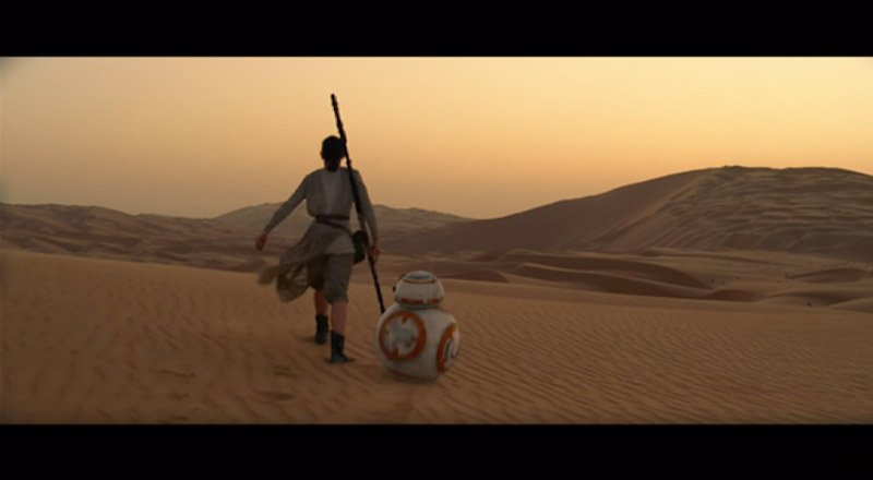
Warm Color Temperature - Star Wars: The Force Awakens
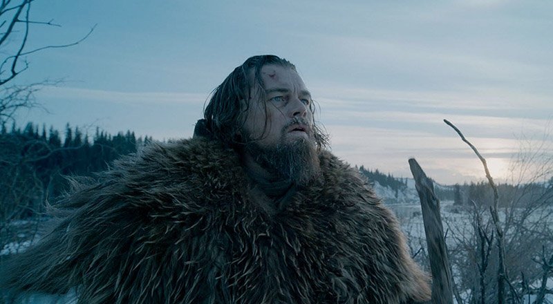
Cool Color Temperature - The Revenant
Exposure
Along with changing the temperature, you can adjust the overall brightness or darkness of a shot with an adjustment to the exposure. Like color temperature, the exposure of a shot is something that needs to be brought to a neutral point in order for it to look natural to the viewer. Our eyes are used to seeing things at certain levels of light depending on the environment. When adjusting exposure, you want the brightest things in a scene getting just barely blown out, with the darkest parts of the screen looking like normal shadows, or even pitch black depending on the environmental conditions. That being said, if you’re going for a specific “other worldly” look you can make the footage look as over or under-exposed as you’d like when grading. Over-exposing can make the viewer feel hot and even a bit claustrophobic, while under-exposing can evoke a sense of mystery and fear. 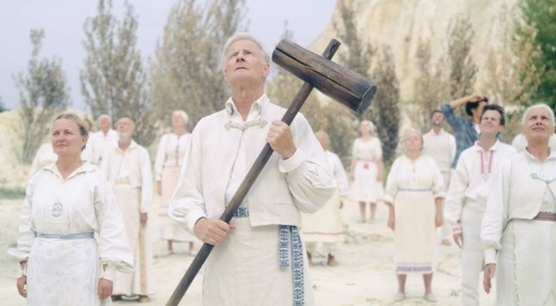
Over-Exposed - Midsommar
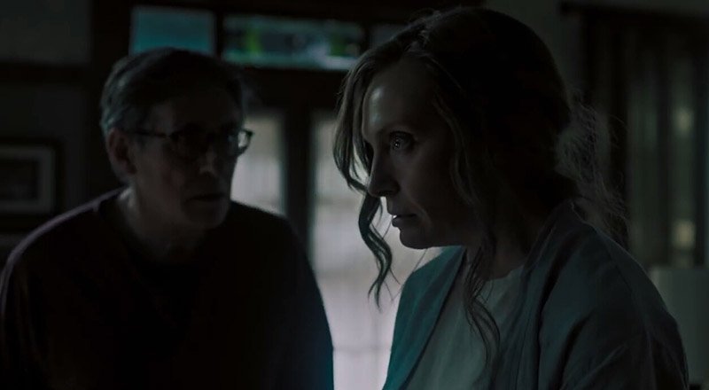
Under-Exposed - Hereditary
Contrast (Highlights/Shadows)
Contrast is the ratio of brightness of the highlights to darkness of the shadows. Thereby, the higher the contrast, the larger the ratio, the larger the difference between the brightest and darkest parts of the shot. Oftentimes, a neutral correction for contrast means that highlights and shadows look realistic for the setting and lighting. A low-contrast stylistic look can make a shot look more subdued, dreamlike or more like what you would expect from something shot on film, making it a popular direction for many indie filmmakers. A high-contrast style will look very intense visually, which is why it’s often a popular look for action films and sports intro videos.

High-Contrast - Joker
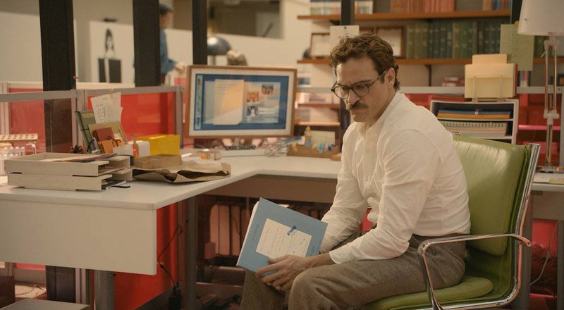
Low-Contrast - Her
Color Intensity (Saturation & Vibrance)
Speaking of intensity, saturation and vibrance are two elements that can control the intensity of color. I like to think of saturation as the “exposure” of color and vibrance as the “contrast.” What I mean by that is: when adjusting saturation you’re increasing the intensity of every color evenly, but when you’re adjusting vibrance you’re either increasing or decreasing the ratio of saturated colors to desaturated colors. Most cameras either need a slight saturation push or pull when correcting to a neutral state. Color grading saturation and vibrance is where it gets really fun. Since you can select specific colors to increase intensity on, you can really make footage go beyond reality and create some incredibly astonishing looks. It’s not all about increasing color intensity though. If you’re going for a more subdued, somber look then you’ll likely want a subtly desaturated shot. If you go even farther with desaturation you can achieve a vintage sepia look, or full-on black and white if that’s what you’re going for.

High Color Intensity - Mad Max: Fury Road
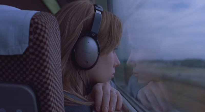
Low Color Intensity - Lost in Translation
These elements are just the tip of the iceberg when it comes to what you can do with color. The most important thing to remember when working with color is that while there is a science to it, it’s a mostly subjective process. I like to use an analogy of a cake when thinking of color with video. Color is like the icing that adds a little something more to the cake underneath, but that cake, or video content in this analogy, needs to be the majority of the substance. A good cake can be decent even with some not-so-great icing, but great icing on a terrible cake won’t be willfully consumed by anyone. If you’re interested to learn more about color, see more examples of these elements or want to see our typical color correcting and grading processes, check out this episode of PEG Reel Talk with our very own color expert, Josh Kuss.